Reinventing strolling and buying in Creavea’s mobile version website.
During my second year internship one of my tasks was to redesign Creavea’s website, more precisely the mobile’s version. First I proposed a benchmark of many other firm’s website (some of them in totally different domains) and after discussions I answered by proposing a functional mock-up of my new design, the new organisation of the website and users experience ways of using it.
Duration
3 weeks
Internship (end of second year)
Skills
Adobe suite (photoshop, illustrator)
Mobile application mock-up on Adobe XD
Goal
Redesigning Creavea’s mobile version website in order to simplify it and make it more effective and attractive.
Home page and sliders
First of all I focused my work on the home page of the website and the sliders.
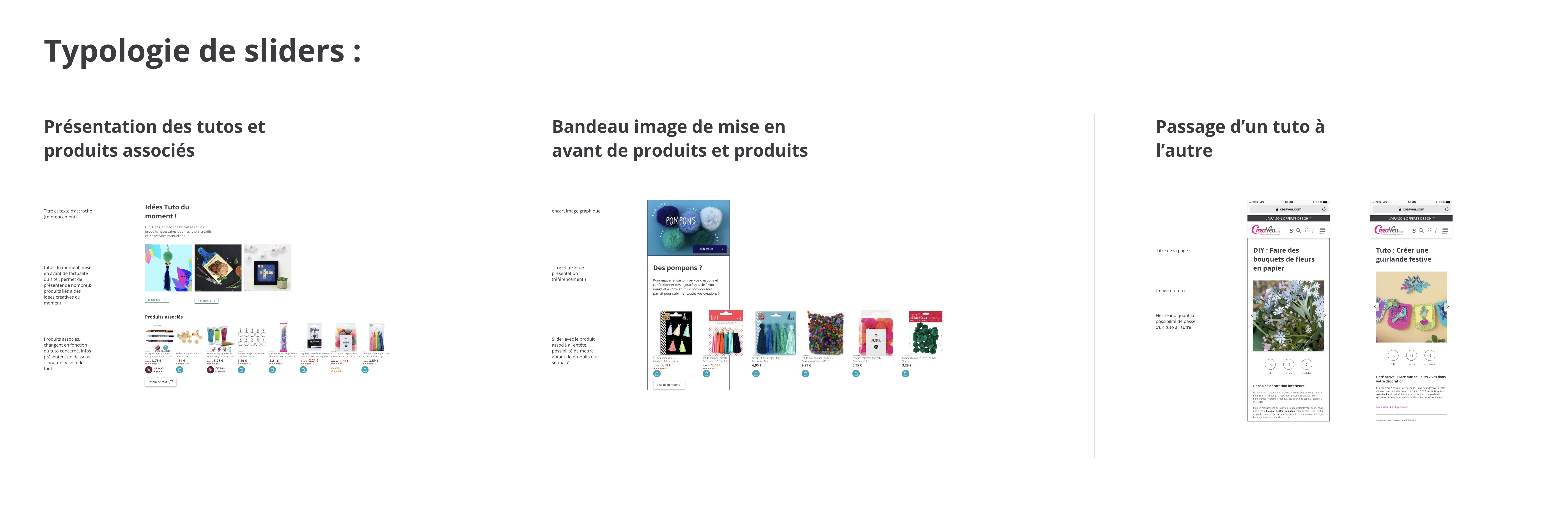
the different typologies of sliders were then explained to Creavea’s developers in another document separate from the mock-up app.
Home page and sliders.
Explanation of the sliders logic.
Categories and products
In Creavea’s website you can find so many categories and products. It is not always clear for the consumer that is why I wanted to focus on this specific task in a second time.
An exemple of categories
A multi-choice product
The consumer shopping basket
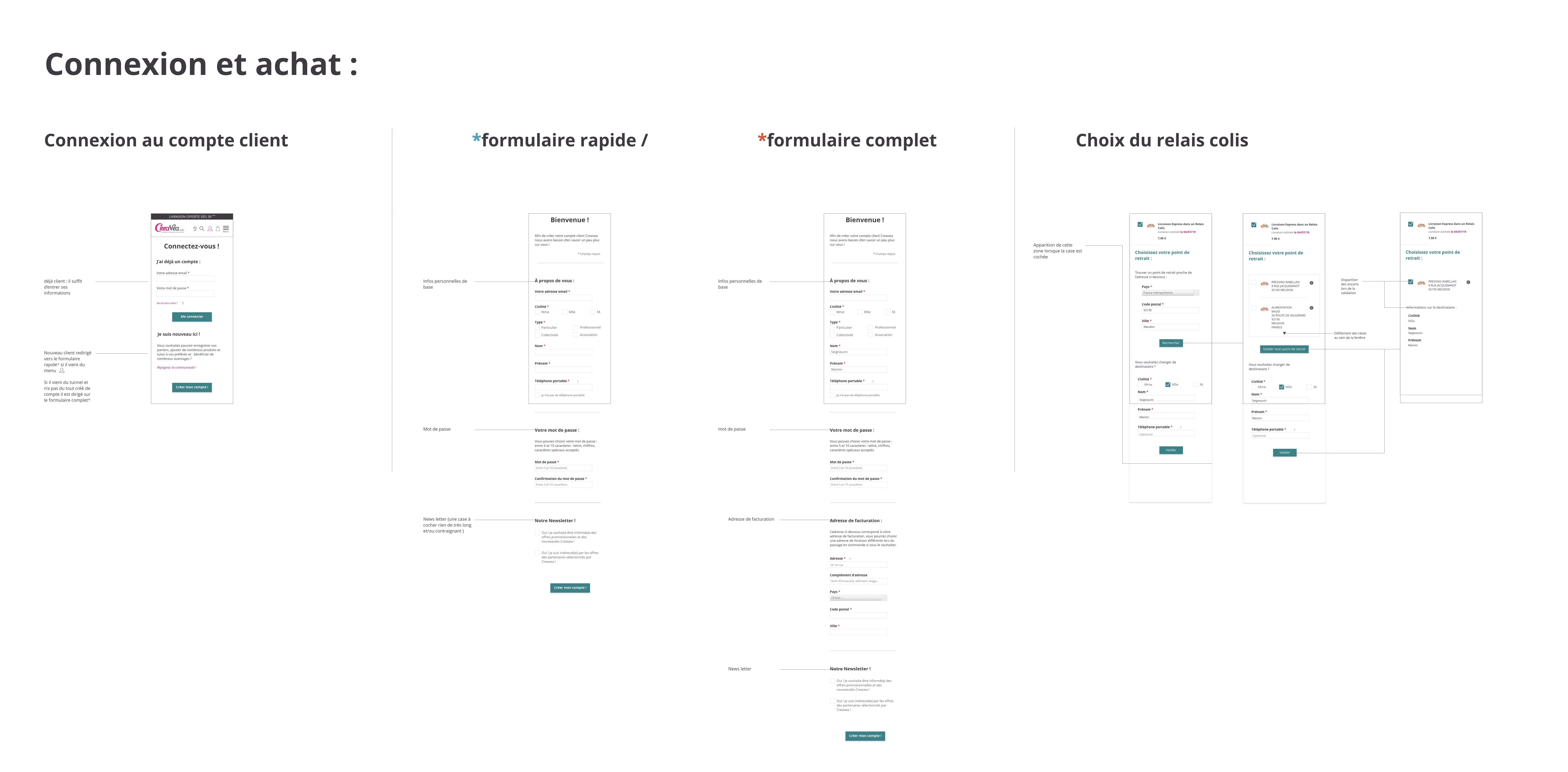
User experience when logging and buying
The buying of producst in Creavea’s website isn’t simple because each product can have various providers. There are also the choices of how to receive the products : at home, in a shop etc…
Each parameter has to be considered to make the customer confident in every steps he go trough.